
Own your name on the web.

Get the deepest insights you possibly can.

Power your brand with a personalized email.

Get all the info you need, fast.
Create your site without code.

Shield your ads and boost real results.

Launch, sell, and track orders effortlessly.

Command and systematize your website.
 (1).svg)
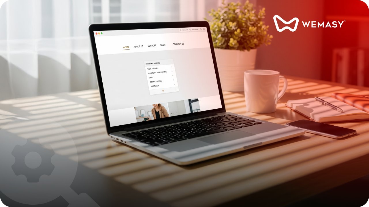
Set it up. Make it yours. Go live.
Create, connect, and go live with one single no-code system.
.png)
Start conversations. Build connections.
Turn visits into action with content, messaging, and interactions curated for your audience.
.jpeg)
Be visible. Be shareable. Be everywhere.
Grow your reach across channels with the right tools working in sync.
 (1).svg)
Stay efficient. Stay informed. Stay in control.
Automate tasks, track what matters, and keep improving to be the best version.
.png)
Learn what makes a website effective, how it functions, and how to build the right one for your brand.
.png)
Learn about webshops and how to build, set up, and manage your online store.
.png)
Learn how SEO works, how to grow organically, and what is important to make your brand visible.
.png)
Learn what social media is, and how to do it right so you can make your brand scale.

See what’s new, what changed, and why it matters.
.png)
Stay informed and aligned with all the concepts you need to know.
.png)
Follow step-by-step guides on how to do things right.
.png)
Pick up smart strategies that help you grow.
.png)
Read about the stories of what inspired us to create our system.

Find sharp insights and lessons to help you grow.
Resources
Real people with real use cases.
Tools that help you instantly.
Explanation of every term.
Who we are and why we exist.
Support
.png)
Find helpful articles and guides to solve your questions quickly.
.png)
Check the current operational state of WEMASY here.
.svg)
Stay updated about the latest additions to our system.
.png)
Get in touch with our team for support or inquiries.


